La convergencia entre los las aplicaciones geoespaciales actuales y la administración pública ofrece una oportunidad sin precedentes para la optimización agronómica. La capacidad de procesamiento de Google Earth Engine (GEE), vinculada a la cartografía vectorial del Catastro rural, permite transformar las series temporales de misiones como Sentinel-2 en herramientas de diagnóstico directo sobre la parcela. Este enfoque desplaza el análisis de una observación puramente visual a una monitorización cuantitativa basada en la respuesta espectral de los cultivos.
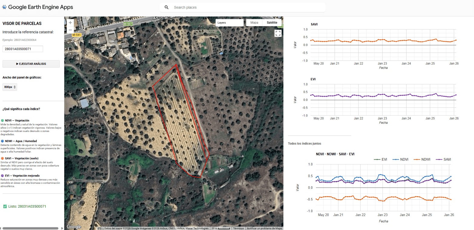
El núcleo de esta aplicación reside en la intersección geométrica de las parcelas catastrales con colecciones de imágenes multiespectrales. Mediante el uso de la API de JavaScript en GEE, se automatiza el cálculo de indicadores biofísicos críticos como el NDVI (Índice de Vegetación de Diferencia Normalizada), el NDWI (Índice de Agua de Diferencia Normalizada), el EVI (Índice de Vegetación Mejorado) y el SAVI (Índice de Vegetación Ajustado al Suelo). Estos índices no solo reflejan el vigor fotosintético, sino que permiten identificar anomalías de crecimiento, estrés hídrico o variaciones en la densidad foliar que son invisibles al ojo humano en las fases tempranas del ciclo fenológico.
La integración técnica busca simplificar la toma de decisiones complejas en el campo. Al normalizar los datos del Catastro, la herramienta facilita que cualquier usuario técnico pueda extraer un informe en formato PDF con la evolución histórica y actual de su explotación. Este reporte actúa como un cuaderno de campo digital, proporcionando la base científica necesaria para determinar con precisión las ventanas temporales óptimas para la siembra, la aplicación selectiva de fitosanitarios para el control de plagas o la programación de la cosecha según el estado de madurez y los niveles de humedad detectados en el terreno.
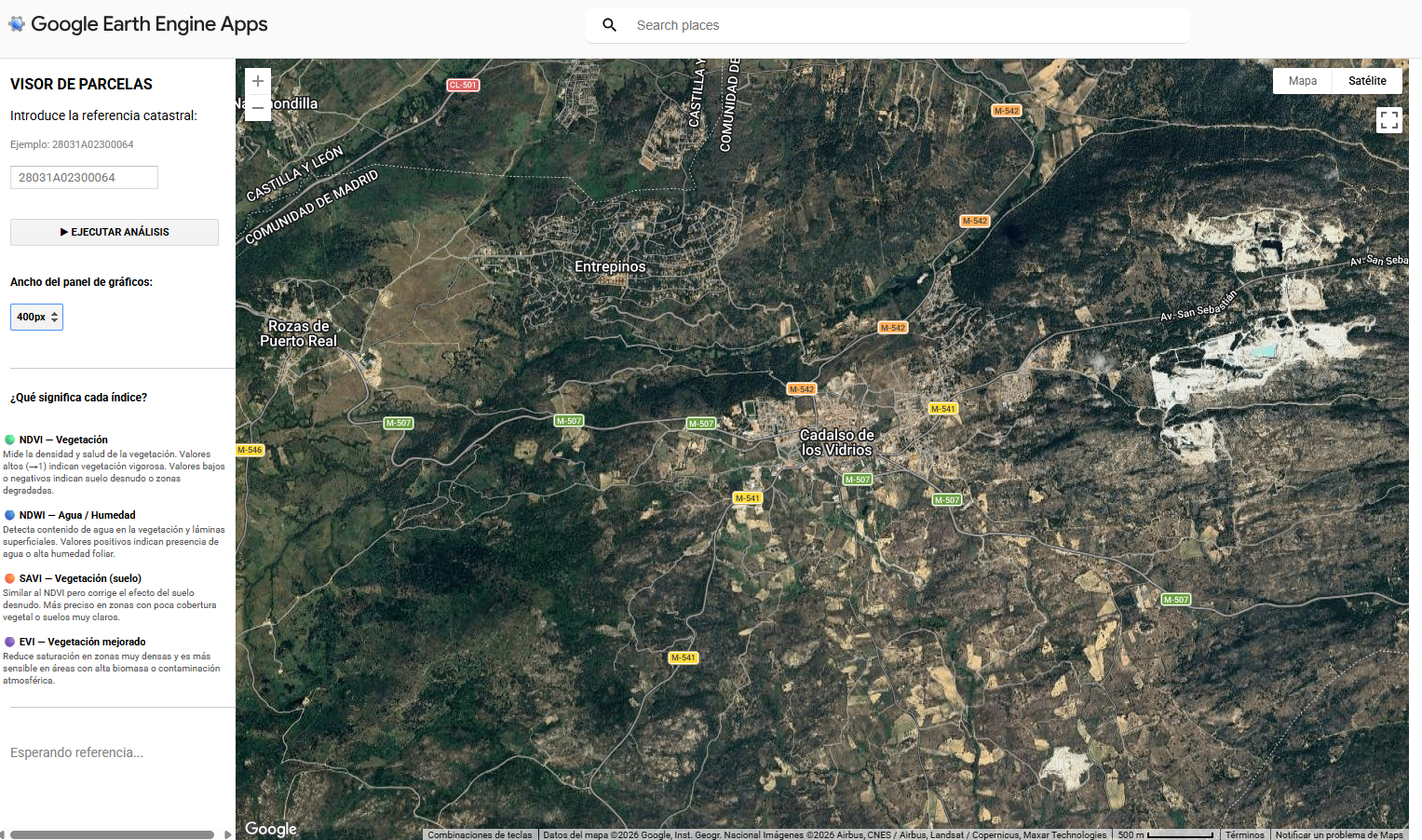
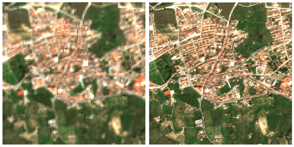
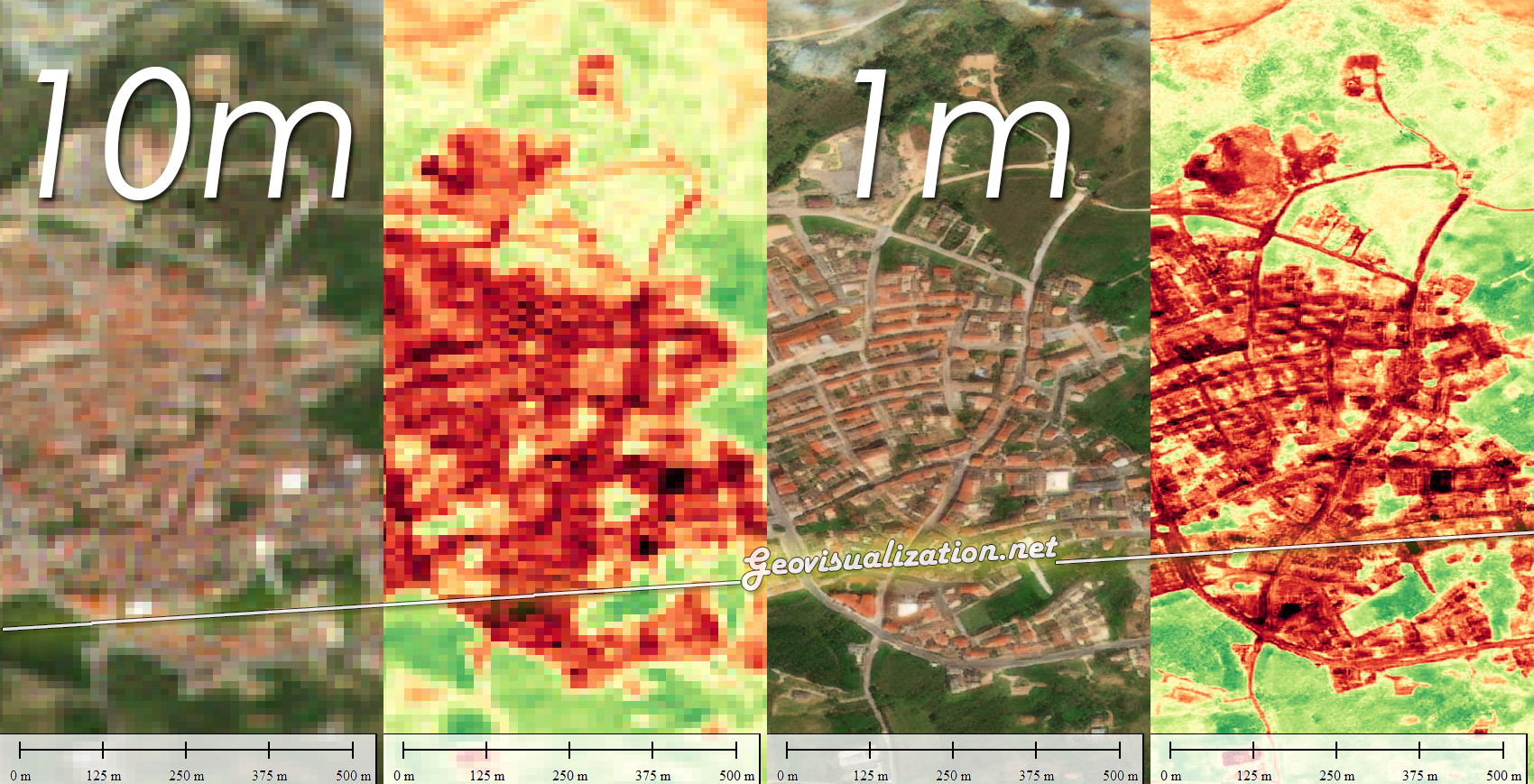
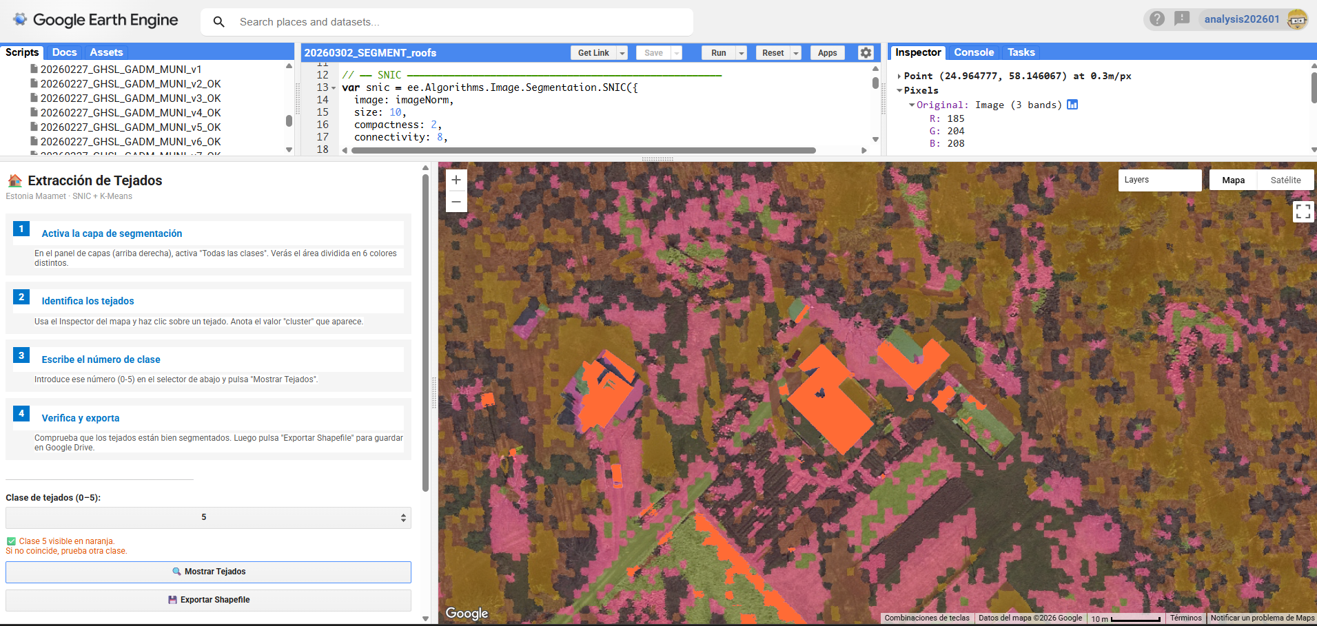
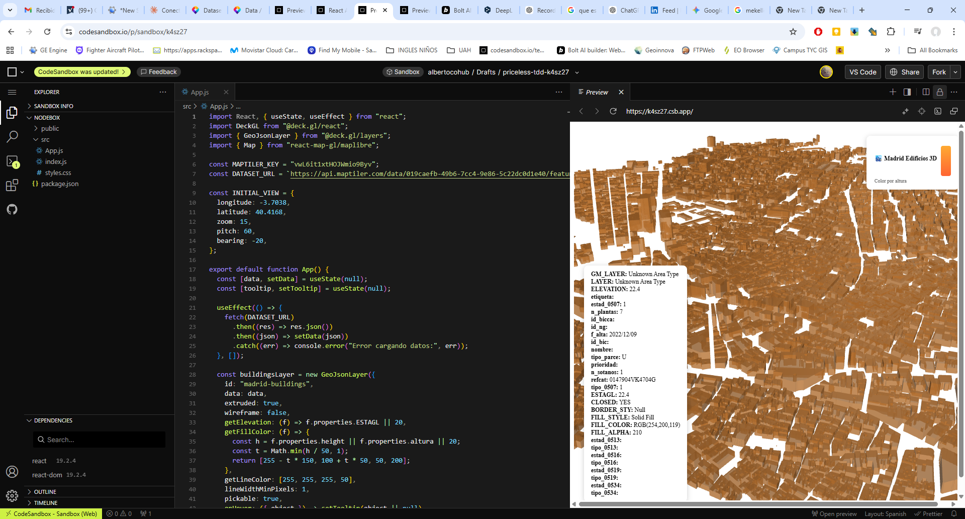
El funcionamiento de la aplicación se articula mediante la consulta de la base de datos catastral (cargada en GEE como un ASSET), permitiendo al usuario introducir una REFERENCIA CATASTRAL específica o buscar por POLÍGONO/PARCELA. Una vez reconocida la geometría de la parcela, el sistema actúa como un motor de filtrado espacial y temporal que realiza una llamada a las colecciones de imágenes satelitales disponibles en el repositorio de Google Earth Engine. Esta arquitectura permite que, de forma automatizada, se extraigan los valores de los píxeles contenidos exclusivamente dentro de los límites de la propiedad, eliminando el ruido de las parcelas colindantes o de elementos infraestructurales que podrían sesgar los resultados del análisis agronómico.
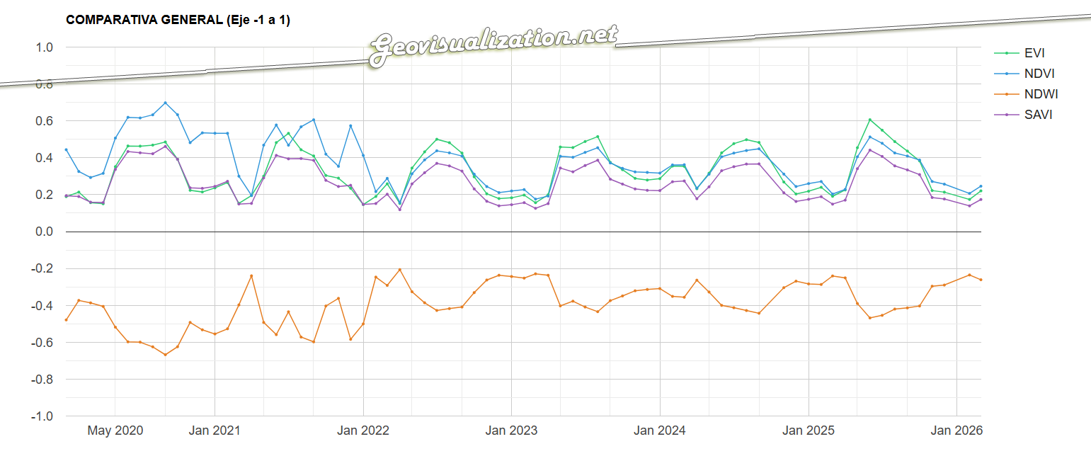
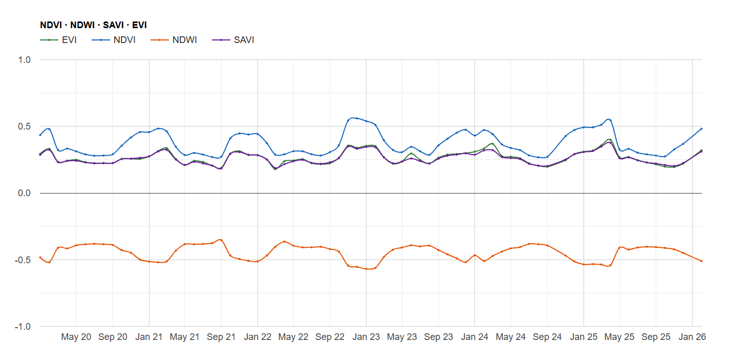
La potencia de esta integración reside en la generación dinámica de gráficos de series temporales y leyendas explicativas que traducen los valores espectrales en estados fenológicos comprensibles. Al seleccionar una parcela, la interfaz despliega una comparativa de índices (NDVI para vigor, NDWI para humedad y SAVI/EVI para densidades foliares complejas) que facilitan la detección de patrones de estrés hídrico o anomalías de crecimiento. Esta capa de información técnica es la que finalmente se consolida en el informe PDF, ofreciendo un registro histórico y actual del comportamiento del cultivo. De este modo, la herramienta no solo visualiza datos espaciales, sino que proporciona un respaldo estadístico para programar tareas críticas como la fertilización, el tratamiento de plagas o la determinación de la ventana de cosecha más eficiente según la madurez hídrica del terreno.

La interfaz se ha estructurado para priorizar la visualización simultánea de la cartografía y la estadística multiespectral. En el panel lateral, el usuario gestiona la entrada de datos mediante la referencia catastral, lo que activa de forma inmediata el renderizado de la parcela seleccionada y la carga de sus atributos espaciales. El visor central ofrece una representación de alta resolución del terreno, mientras que el área de análisis despliega gráficos interactivos que segmentan las series temporales por índices. Esta disposición permite correlacionar directamente las variaciones visuales sobre el mapa con las fluctuaciones en las curvas de vigor y humedad, facilitando una interpretación técnica rápida de la evolución fenológica del cultivo sin salir del entorno de trabajo.
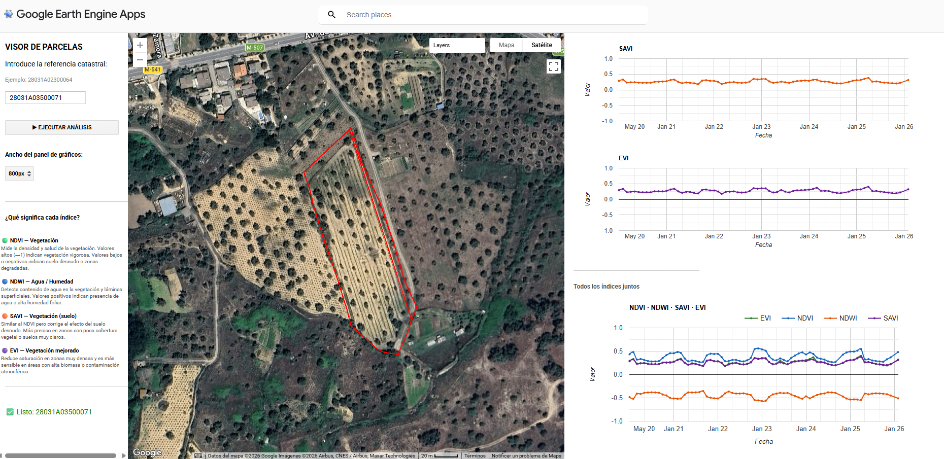
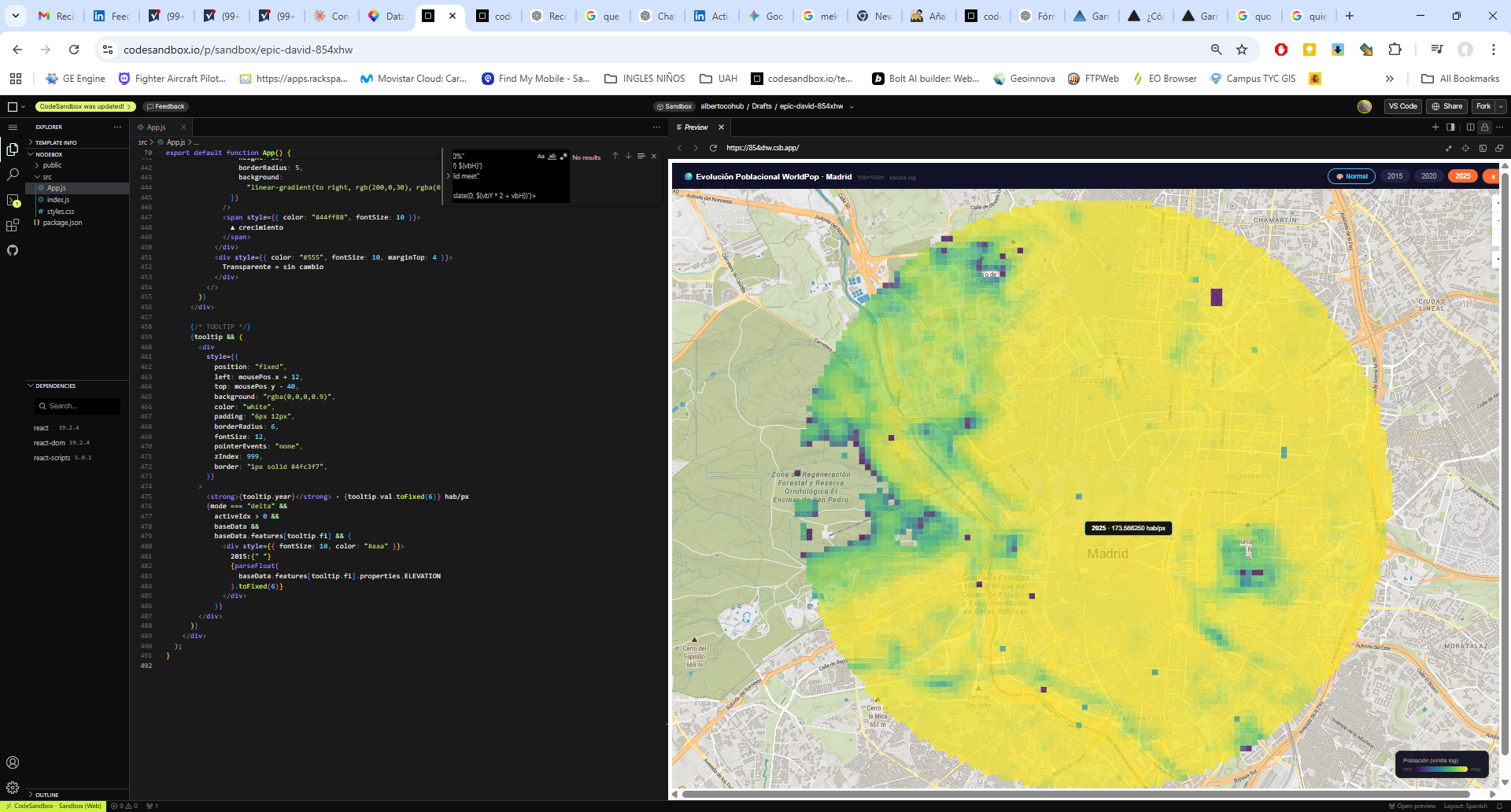
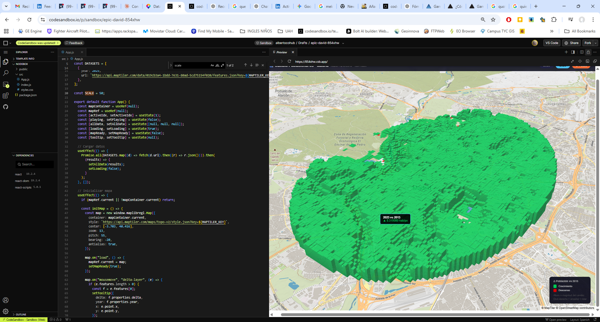
El componente analítico se materializa en la generación de series temporales multianuales, donde la superposición de los índices permite una lectura cruzada de la salud del cultivo. Al graficar conjuntamente métricas como el NDVI y el NDWI, es posible identificar con rigor técnico el desfase entre el estrés hídrico y la pérdida de vigor fotosintético. Esta serie histórica no solo sirve para el diagnóstico actual, sino que permite establecer líneas base de comportamiento fenológico, fundamentales para predecir anomalías climáticas o evaluar la efectividad de tratamientos agronómicos previos a escala de detalle.
La aplicación culmina con la generación de un informe PDF que traduce el Big Data en decisiones de campo inmediatas. Al automatizar la integración entre GEE y Catastro, se elimina la barrera técnica, permitiendo que cualquier usuario interprete los ciclos críticos de su explotación sin necesidad de procesamientos complejos. Es, en definitiva, convertir el rigor científico en una herramienta operativa, legible y directamente aplicable para maximizar la eficiencia en cada parcela.
Espero que lo encuentres interesante, si es así, manda un saludo al menos! La verdad es que hay un millón de cosas que se pueden hacer usando Javascript en GEE, construyendo APP operativas desde el minuto cero, orientadas a Smart Cities o en este caso más concretamente a Smart Towns 🙂
Alberto C.
Analista Geoespacial
catastro.gob.es @catastro_es #MinisterioTransformaciónDigital #GEE #AgriculturaDePrecisión #GIS #RemoteSensing #Teledetección #BigData #Sentinel2